Step by Step Guide for Creating a Reading Habit Tracker in Google Sheets

Read on Medium
Tracking your reading habits is essential to staying consistent and motivated in your reading journey. While many readers prefer using physical notebooks or apps to log their progress, I found a personalized Google Sheet to be the perfect tool as a tracker, because we can heavily customize it, integrate other tools, and access it anywhere on the Earth if you have a device with internet and your Gmail account signed in. In this story, I will walk you through the steps to create a reading habit tracker using Google Sheets and the data I collected over the years.
Just a minute, I wrote another story about "How Reading Changed My Life" (click to read it). This story continues one of the sections (Reading Habit Tracker: A Work in Progress) of that story.
Let's Start
1. Setting Up the Google Sheet
I started by adding the required sheets to an empty spreadsheet on Google Sheets. I have four of them: Dashboard, Reading, Finished, and Lists.
 4 Sheets I used to track my reading
-
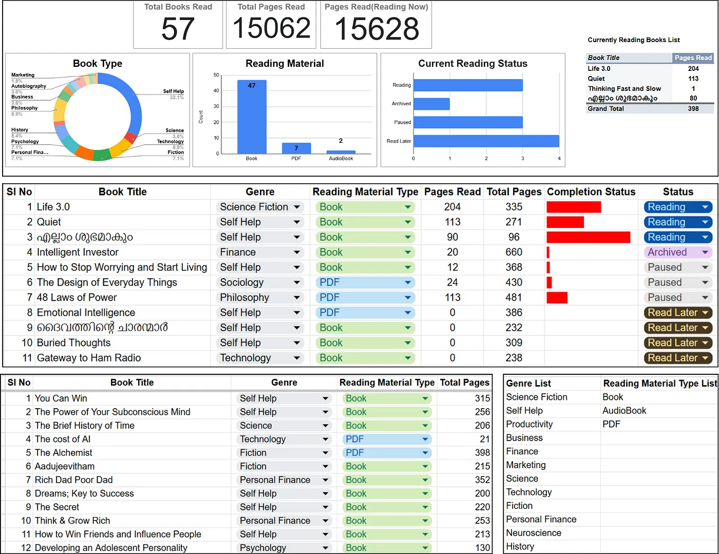
The Dashboard contains some visualization as Scorecard, Doughnut and Bar charts, and two Pivot Tables.
-
The Reading sheet contains the current books I am reading and there are 8 columns, they are Serial number, Book Title, Genre, Reading Material Type, Pages Read, Total Pages, Completion Status, and Status(Reading, Archived, Paused, and Read Later).
-
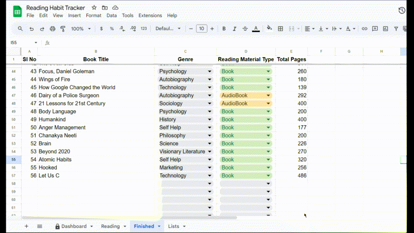
The Finished sheet contains the books that I have finished reading, there are 5 columns similar to the Reading sheet, the Serial number, Book Title, Genre, Reading Material Type, and Total Pages.
-
The List sheet contains the contents for drop-down for Genre and Reading Material Type. We can append more items to these lists as required in the future, rather than editing the drop-down list from its settings. The reason for moving the list to a separate sheet will be explained later.
 Snapshot of all sheets in my Google Sheet File
The above image show my sheets, the first image is the Dashboard, the second is the reading list, the third on the left bottom corner is the finished books list, and the fourth on the bottom right corner is my Lists sheet.
2. Setting the structure and adding the data
Starting with the Lists sheet, I manually entered some Genres and Reading Material Type and I can add as many items to these lists as I continue classifying the books and they will automatically appear in the dropdown list, given I selected the ample amount of rows which giving the data range of dropdowns.
Tip: See the image above if you want to see the outputs while reading these paragraphs.
Next setting up the Reading Sheet, the first column is Serial Number I typed 1, 2, and 3 and selected these 3 numbers, and dragged up to 11 to get the numbers automatically on my sheet. Next is Book Title I manually entered each book I hold currently.
The next one is the Genre column for which I have to input a dropdown for selecting the genre for each book. To do it
-
Select the range up to where you need the dropdowns.
-
Click on the Insert button in the Menu tab and click Dropdown. Suddenly a chip-like dropdown will appear on the selected range, and the Data Validation Rules settings will appear on the right side of your Google Sheets.
-
In the Data Validation Rules, you can see a Criteria setting option, it’s also a dropdown. Expand the dropdown and select the ‘Dropdown (from a range)’ option.
-
Now you will see an empty box just below the Criteria settings, there is a window icon to the right side of the empty box, click to select the data range from where you want to fetch the option for your dropdown (in my case, the Lists sheet)
-
In addition, you can select colors for each of the options, which appear on the left side of each of the options on the Data Valuation Rules setups.
-
To commit the changes press the Done button and select each genre corresponding to the book title from the dropdown list.
The same set of steps were done for the Reading Materials Type and Status columns, I just added color for the dropdown entries.
For completing the Pages Read and Total Pages I have to manually enter the values, and the Pages Read are updated once a week. The next one is the Completion Status column which contains a bar chart in red color showing a visual cue of completion, rather than seeing the page numbers. It is done using a formula called Sparkline in Google Sheets.
=SPARKLINE(pages_read, {"charttype","bar";"max",total_pages;"color1",if(pages_read<total_pages, "red", "green")})
-
pages_read: cell reference to the data point that the chart will represent.
-
{“charttype”,”bar”;”max”,total_read;”color1", if(pages_read<total_read, “red”, “green”)}: This is an array of options that customize the chart: charttype, bar: Specifies that the chart type should be a bar chart. -
max, total_read: Sets the maximum value for the chart’s scale, using the value in cell total_read.
-
color1,
if(pages_read<total_read, “red”, “green”): This part determines the color of the bar:- If the value in pages_read is less than the value in total_read, the bar will be red, else bar will be green.
The entries on the Finished Sheet were similar to the Reading sheet, the only difference is the count of books is more than 50. I have the book title and total pages as text separated by a hyphen in my Google Keep Notes(for example, You Can Win — 315), I copied the note to a column in the Finished Sheet and named the column Book Title. Then split the text using the ‘Split Text to Columns’ option under the Data tab of the Menu bar with the separator (delimiter) as a hyphen, it will detect the separator automatically or we can select the delimiter as a comma, semicolon, period, space, or custom. After that, I just need to rearrange the columns. The only tiring process for both the Reading and Finished Sheets was the manual selection of genre and reading material type from the dropdown, if you have any suggestions to do it faster please comment.
3. Making the Dashboard
A dashboard is the place where our data gets its shape, most managers look into some dashboards to make decisions that shape the future of a company. My dashboard is simple and intuitive as I need to get the idea with a single look rather than scrutinizing the charts. The type of visualizations used were Scorecard charts, which display a number in big letters just like a scorecard in games, a Donut chart or a Pie chart with a hole, Bar charts both vertical and horizontal, Pivot tables, and slicers. And these slicers will change the charts based on our selection, just like a filter.
Now let’s move on to the setting of each chart.
First, to insert a chart, you press the Insert button on the Menu bar and click on the Charts, or you can access the same button on the right side of the Quick Access toolbar. When Inserting a chart, a dialog box called Chart Editor pops up on the right side of Google Sheets. In the Setup tab of the Chart Editor you need to select the Chart Type from the dropdown list, there are many types of charts Line, Area, Column, Pie, Scatter, Map, and Other.
 My Dashboard
To add the first three charts (the scorecard charts), you press the Scorecard Chart under Other Options. When you click on this Scorecard Chart, you need to add a key value, for that select the data range and aggregate option (in my case it is the count of Book Title in the Finished sheet). The same goes for the ‘Total Pages Read’ and ‘Total Pages (Reading Now)’, only difference is the data range. For Total Pages Read, the data range is the Total Pages column of my finished sheet, and aggregate it by SUM. And ‘Total Pages (Reading Now)’ is actually calculated in a cell underneath the scorecard, the formula I used is =SUM(Finished!E:E, ReadingE2:E11) sum of the finished sheet’s Total Pages and Reading sheet’s Pages Read.
For adding more charts, you should have a clear understanding or a plan in your mind about what visualizations you need to see and from which columns. In my mind, I want to see the visualizations of my book type, Reading Materials Type, and Current Reading Status, in different visualizations like pie charts, bar charts, etc.
First, add the Book Type to a Pie chart. Add a new chart and select the chart type as pie. Then select the data range by clicking the window icon on the data range, drag, and select the data range(in my case, genre in Finished sheet). It will appear as a pie chart automatically, if it doesn’t appear or you selected the whole data, then you can select the label from a list of column names and aggregate the value if needed. When I see it as a pie chart, I think it would be much better if I put a hole in the middle of that pie chart, that is to make it a donut chart. I selected the chart type as a donut, and the additional settings were checking ‘Use of row 1 as headers’ in the setup tab, legend as labeled on the customize tab, and the donut hole size as 75% in the pie chart option of the customize tab.
The next one is the Reading Material Type. For that, I added a column chart and selected the data range as Reading Material Type from the Finished sheet. On the X-Axis option, it automatically appeared as Reading Material Type and I checked the aggregate box to see the visualization. As additional settings, I checked ‘use row 1 as header’, changed the font size and some formatting also displayed the count inside the bars by checking the data labels option in the Series dropdown in the customize tab of the chart editor. Similar to this, I added the Current Reading Status visualization with horizontal bars, with the data range Status column from the Reading sheet.
 3 Charts in My Dashboard
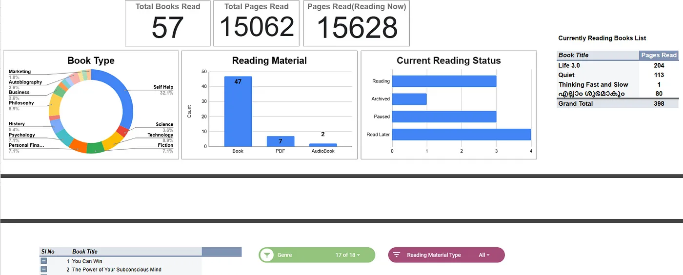
Next, I need to have two Pivot Tables in my dashboard to see the Currently Reading Book List and All books with Slicers applied. The Pivot Tables help us see our data from another view with aggregations including sum, average, count, etc. I opted for the pivot table because it automatically adds or deletes content whenever the data in the reference changes.
To create a pivot table, go to the Insert option in the Menu bar and click Pivot Table, then a small dialog box named ‘Create Pivot Table’ will appear. You need to select the data range and the sheet to which the table is to be inserted (New or Existing sheet).

Create Pivot Table dialog box
For my small pivot table, I selected the whole Reading sheet in the Data range and the Existing sheet radio button to add the table to my Dashboard sheet. With this, a skeleton of the pivot table will appear in the pivot table options, now we need to add rows, columns, values, and filters to the table to get the new view. I added Book Title in the rows as I need to see the book titles as the row value, Pages Read in values as I need to see how many pages I read for each book, and finally Status as filter to filter reading status only to view books with status Reading.
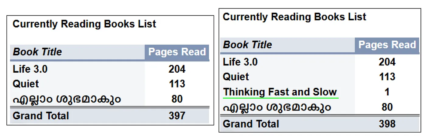 'Currently reading books' pivot table functionality
For the big pivot table, I did the same process for adding the table. Selected the whole data of the Finished sheet added the Serial Number and Book Title in the row and kept columns, values, and filters empty because I need to add a slicer for this dashboard to see different views based on some filters. So I added two slicers(for adding a slicer, click the Data button on the Menu bar and click Add a slicer, then as a rounded rectangle the slicer will appear on your sheet), the data range was column C and D for the genre and reading material type slicers respectively from the Finished sheet. Now I can select the required option in genres like Science to see the books related to that genre, and when we have some options in the slicers the other visualizations will also change. See the image below.
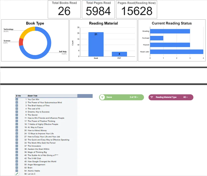 3 Options selected in slicer, and corresponding change in other charts
4. Additional Features
By this time the tracker is somewhat ready, but I found a missing feature. Whenever I finish reading a book I need to move the book from the Reading sheet to the Finished sheet manually. So I planned to automate this task using a simple Google App Script. See the code below
// App Script code to automate moving completed books
function onEdit(e) {
  var sheet = e.source.getActiveSheet();
  var editedRange = e.range;
  var ReadingBooksSheet = "Reading";
  var FinishedBooksSheet = "Finished";

  if (sheet.getName() === ReadingBooksSheet) {
    var row = editedRange.getRow();
    // Reading Status in Column H (8th column)
    var Status = sheet.getRange(row, 8).getValue();

    // If progress stage is marked as "Finished"
    if (Status === "Finished") {
      var rowData = sheet.getRange(row, 1, 1, 7).getValues()[0];
      // Use 'sheet.getLastColumn()' to get full row

      var targetSheet = e.source.getSheetByName(FinishedBooksSheet);
      targetSheet.appendRow(rowData); // Move the row to the Finished Sheet

      sheet.deleteRow(row); // Delete the row from the Reading sheet
    }
  }
}
This code when saved and run will throw an error, but don’t worry see the explanation from Mr Shane on Google Docs Editors Help.
 App script error
Now with this code applied, whenever I change the Status of a book in the Reading sheet, within a second, the row will be moved to the Finished sheet. See how it works on my Google sheet
 Working of Google App script to move finished book
Let's explore the code.
function onEdit(e) defines a function onEdit that will run automatically whenever a user edits a cell in the Google Sheet. The parameter e is an event object that contains information about the edit event. The e.source.getActiveSheet() gets the currently active sheet (the one being edited) and e.range gets the range of cells that were edited (where the edit occurred). Next, I defined the variable names for Sheets, and if (sheet.getName() === ReadingBooksSheet) checks if the active sheet (the one being edited) is the Reading sheet, if it is then editedRange.getRow() gets the row number of the edited cell, with this row number we find the status using sheet.getRange(row, 8).getValue() where 8 is the column H on which Status of the reading progress exist.
If the Status is Finished, then the data in that row is taken using sheet.getRange(row, 1, 1, 7).getValues()[0] here
-
row: the starting row
-
1: the starting column, A
-
1: number of rows to return, only 1
-
7: the number of columns to return, from A to F.
-
The
getValues()[0]is used to get the first row of data from the returning two-dimensional array.
The targetSheet.append(rowData) appends the data to the end of the Finished sheet as a new row and sheet.deleteRow(row) deletes the current row from the Reading sheet. Here this deleteRow deletes the complete row, and I have placed the list for dropdowns like Genre and Reading Material Type near these rows, when the deleteRow() deletes the item in the row, it will delete an entry of the genre list too, thereby bringing problem for the genre dropdown, see the image.
![]() Red mark near Autobiography indicates an error
Red mark near Autobiography indicates an error
Conclusion
The beauty of using Google Sheets is the real-time update feature. As soon as I add a book to the reading list, the charts and the pivot tables get updated automatically. When I finish a book or change its reading status to Finished, the app script will move the row to Finished sheet, effectively saving me a lot of time. With this tracker, I can review the data in equal intervals to track my progress and adjust my reading habits as needed.